
More on Data Visualization
January 31th, 2024
Maybe…
- We could tell R something like…
- Consider the data frame
- Count number of mothers in each
smoke - Put
smokeon x-axis. - Put
counton y-axis. - Draw the bars.
These ideas are all correct but some are not necessary in R
- Consider the data frame
Count number of passengers in eachsmoke- Put
smokeon x-axis. Put.counton y-axis- Draw the bars.
R will do some of these steps by default.

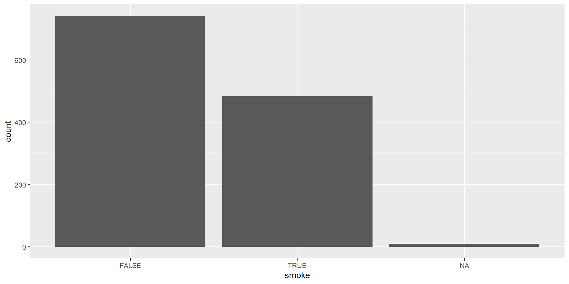
Bar plot - Step 1 - Pick Data
Let’s use smoke variable within babiesdataset which is a categorical variable indicating whether the mother smokes or not.

Bar plot - Step 2 - Map Data to Aesthetics
Let’s use smoke variable within babiesdataset which is a categorical variable indicating whether the mother smokes or not.
Bar plot - Step 3 - Add the Geometric Layer
Let’s use smoke variable within babiesdataset which is a categorical variable indicating whether the mother smokes or not.


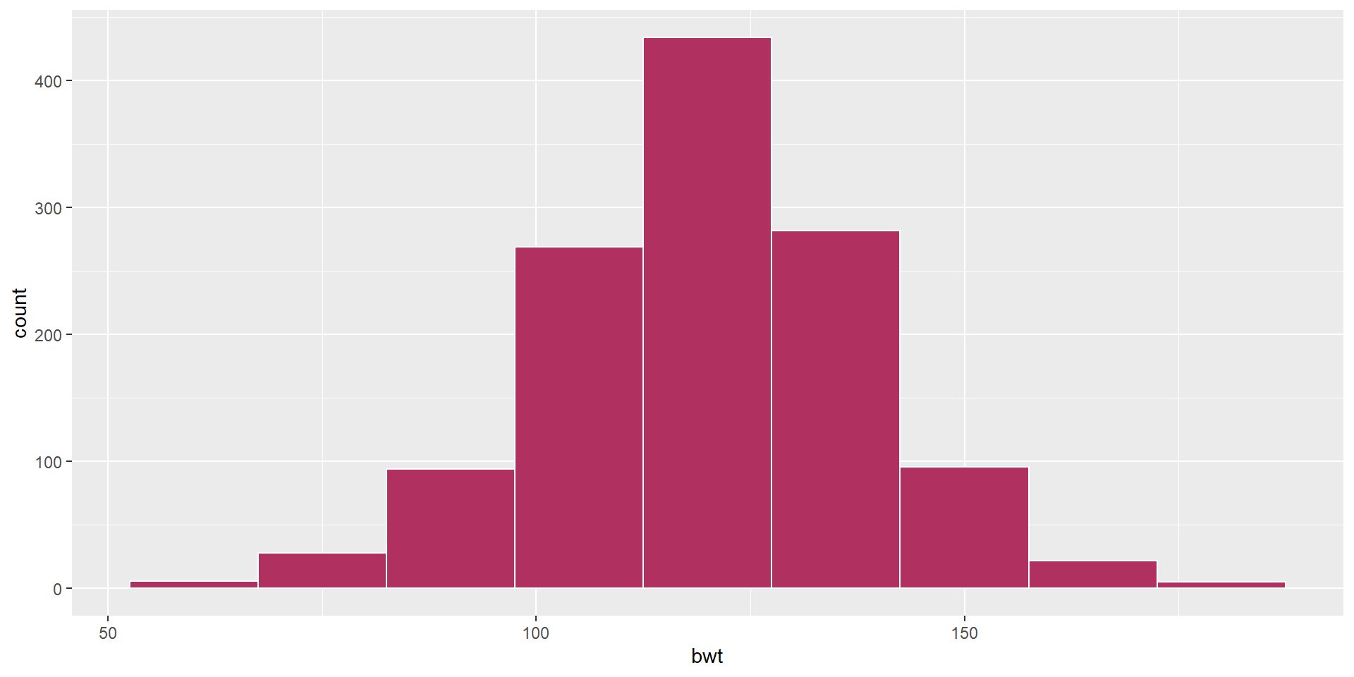
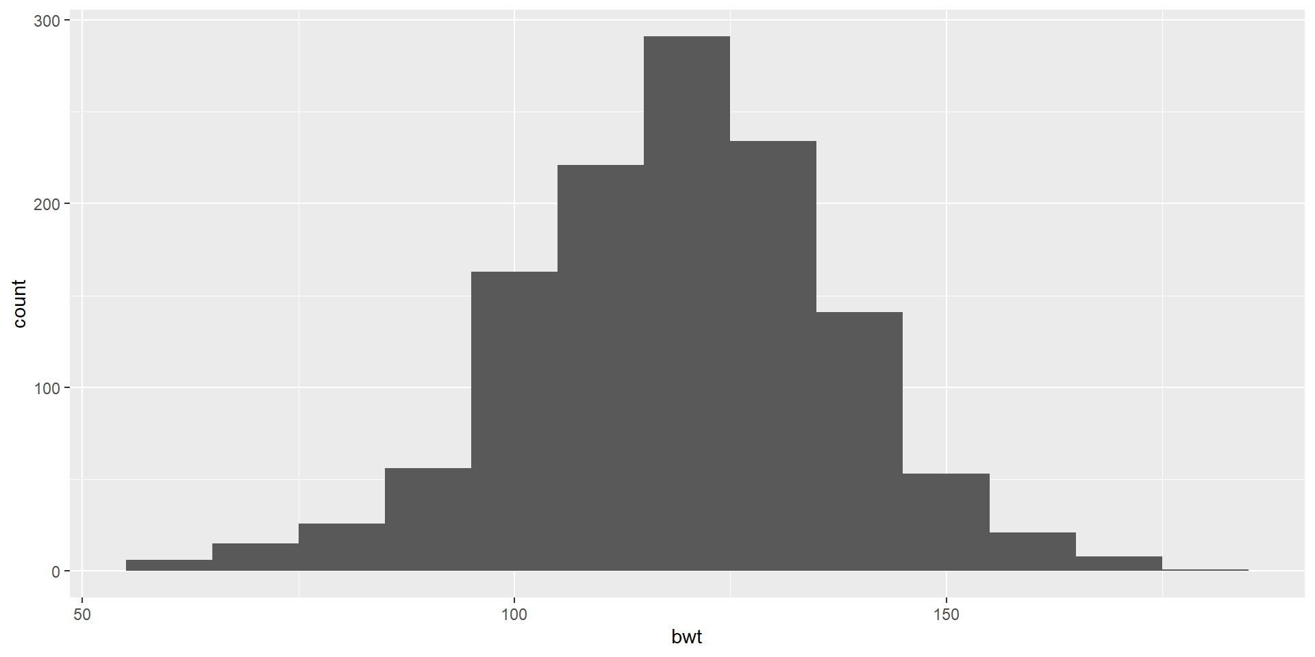
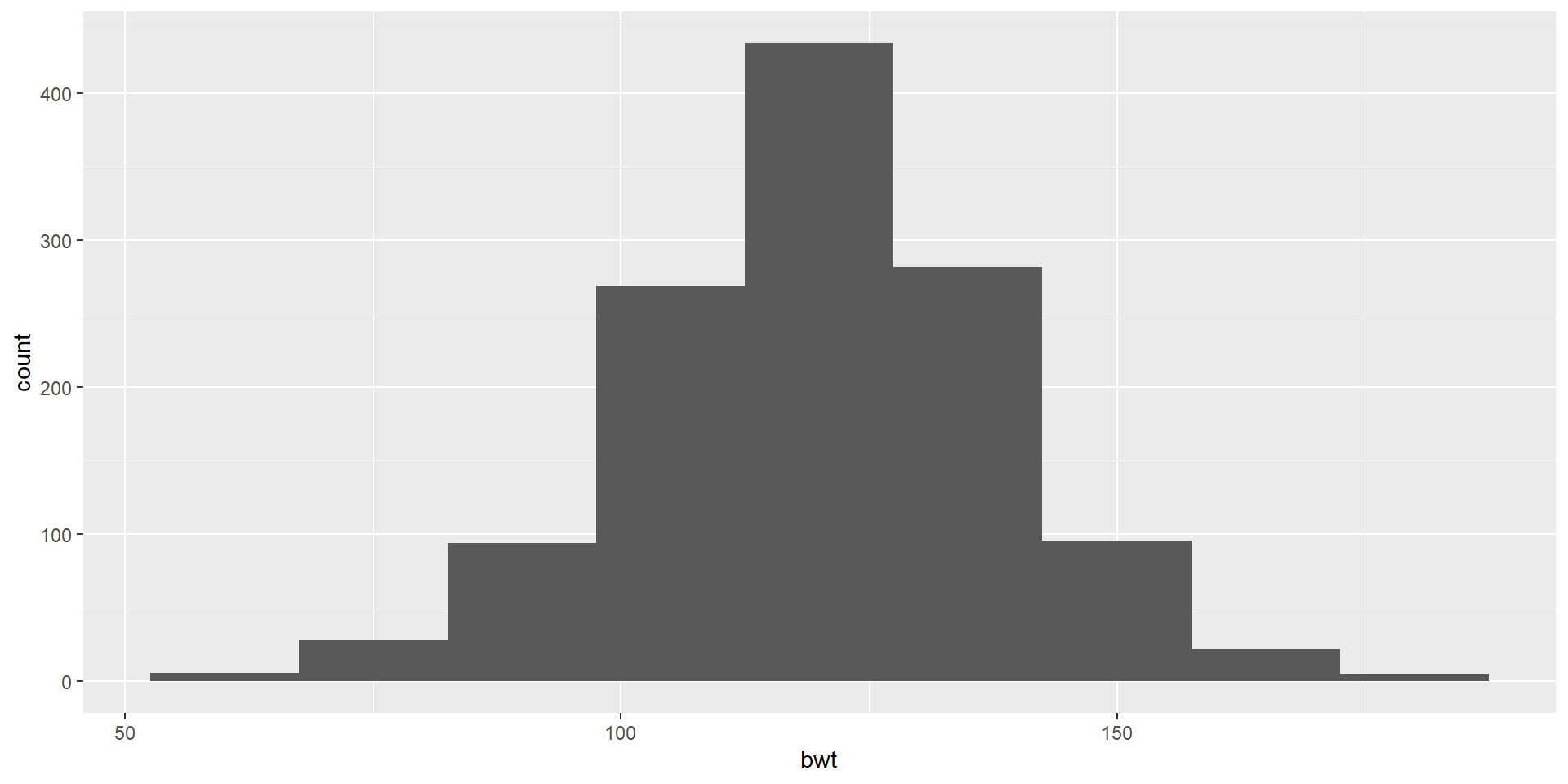
Histogram
Let’s use bwt variable which is a numeric variable indicating birth weight in ounces
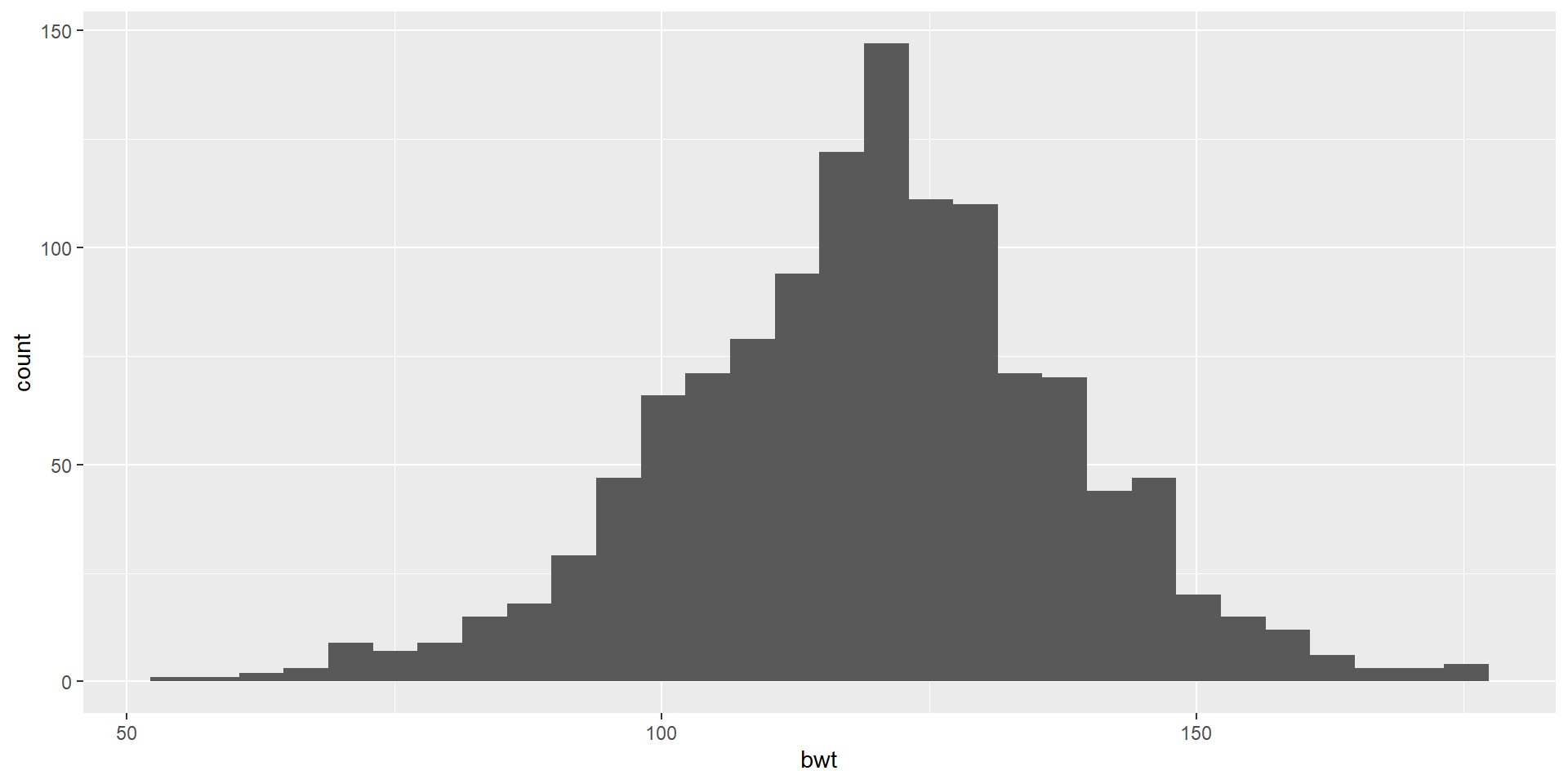
Histogram
Let’s use bwt variable which is a numeric variable indicating birth weight in ounces

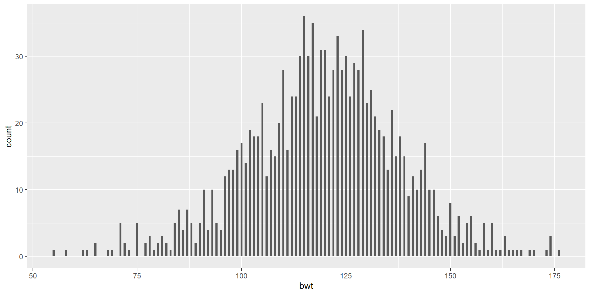
A Colorful Histogram
Let’s use bwt variable which is a numeric variable indicating birth weight in ounces
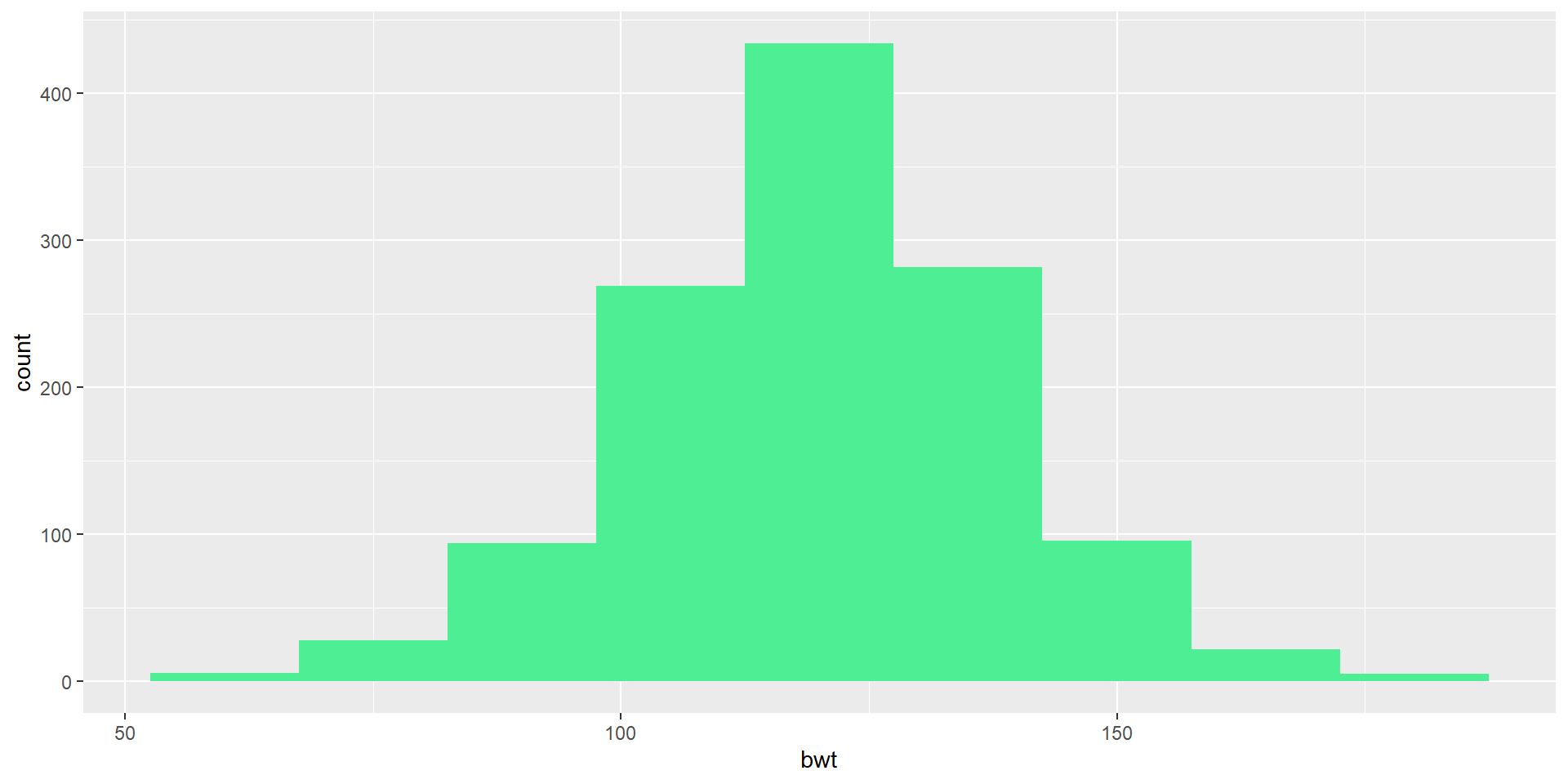
A Colorful Histogram
Let’s use bwt variable which is a numeric variable indicating birth weight in ounces

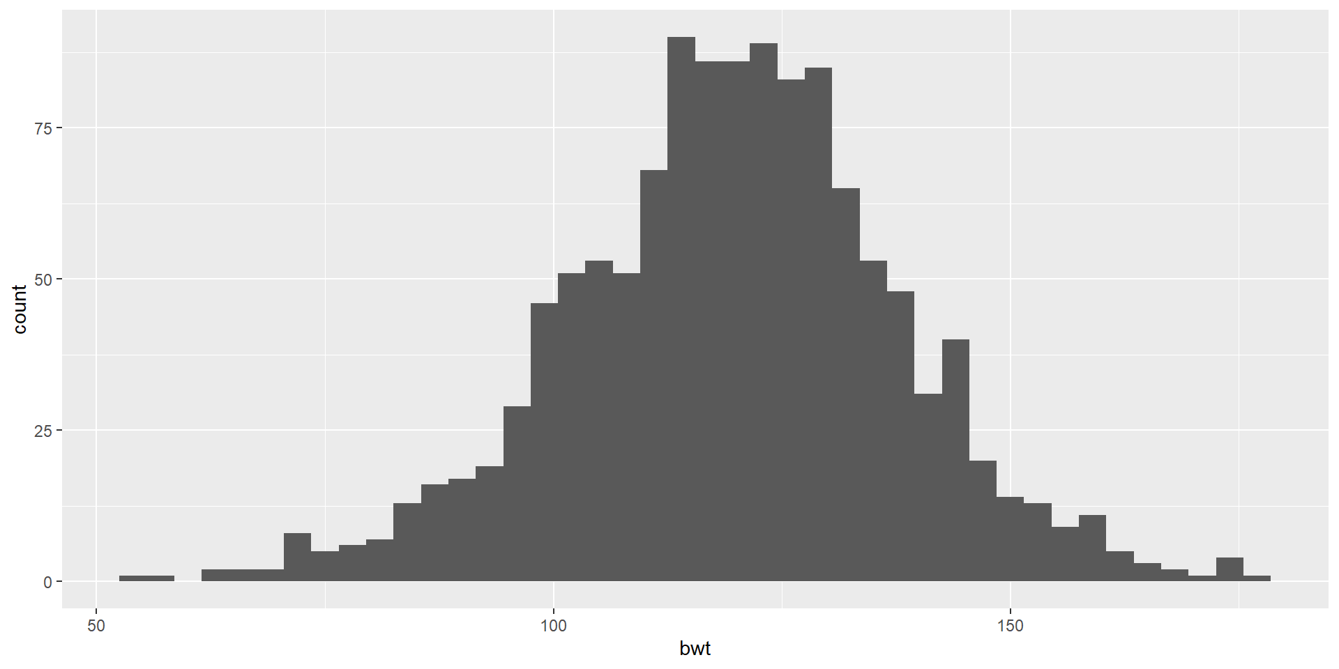
Choose your own color
- Create a ggplot using the babies data frame.
- Map the
bwtto the x-axis. - Add a layer of a histogram.
- Change the binwidth to 15.
- Color the borders of the bars (bins?) as white.
- Fill it with a color code named maroon
Stacked Bar-Plot
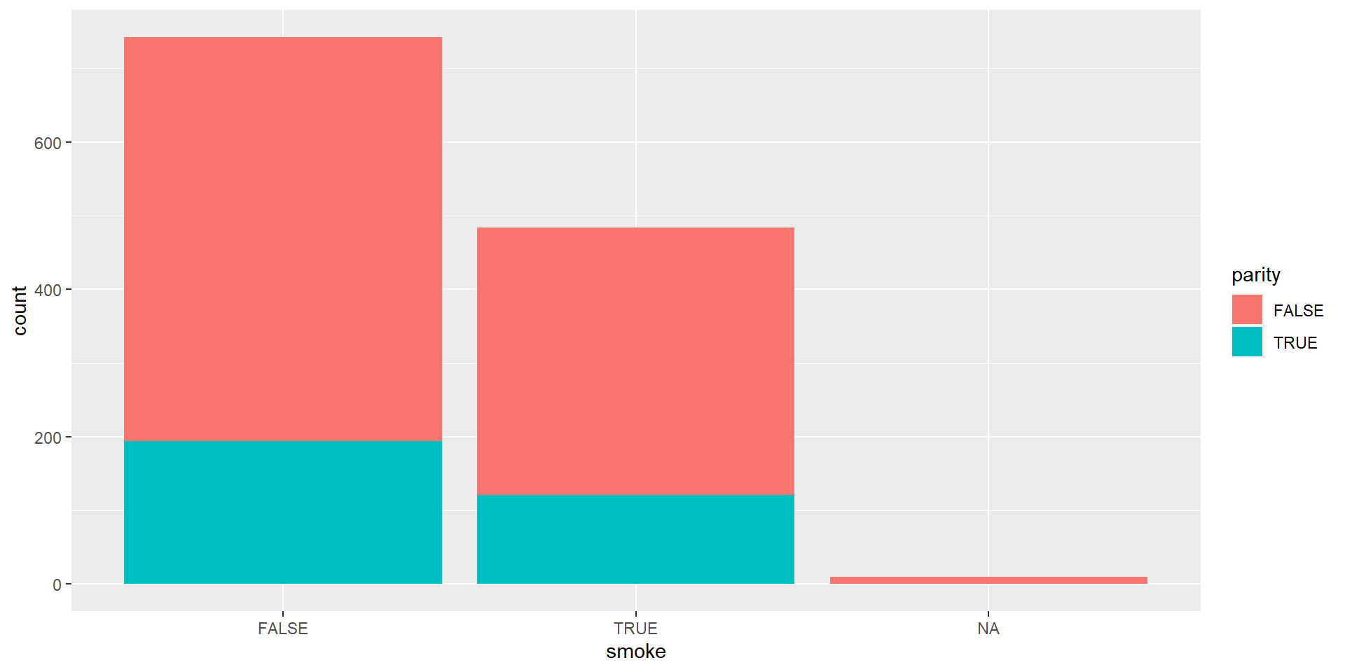
We are using the variables of parity: binary indicator for a first pregnancy and smoke: binary indicator for whether the mother smokes.
Standardized Bar Plot
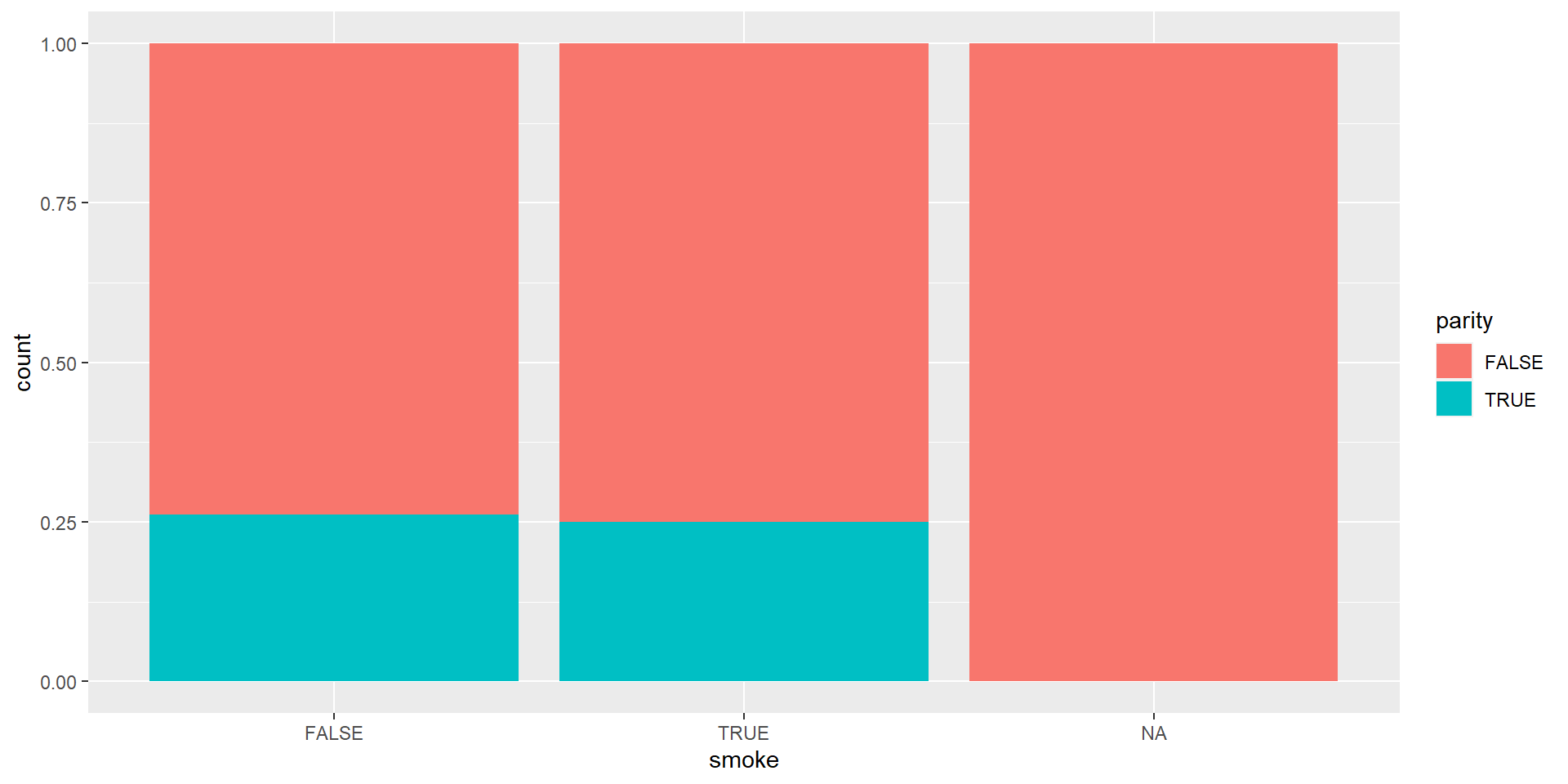
Now we will try to fill the y-axis as if it is something look like percentage which is called Standardized Bar Plot. Note that y-axis is no longer count but we will learn how to change that later.
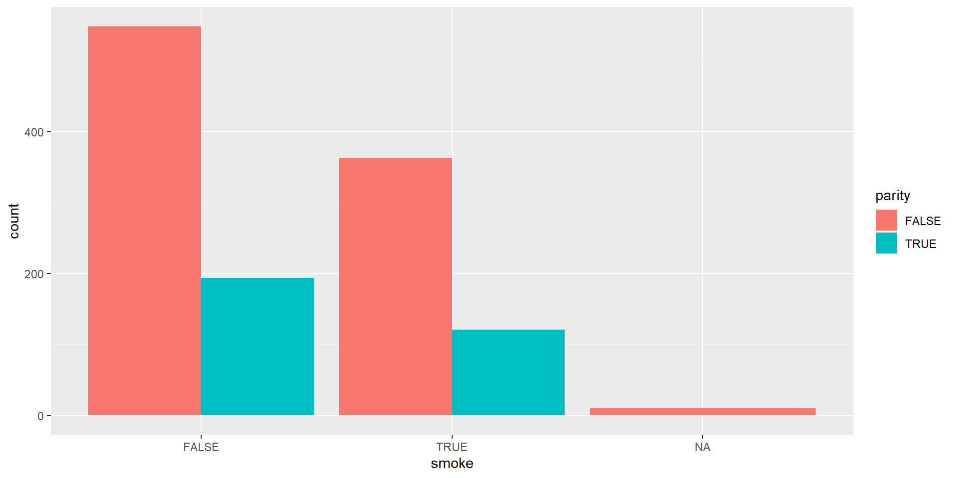
Dodged Bar Plot
Boxplot
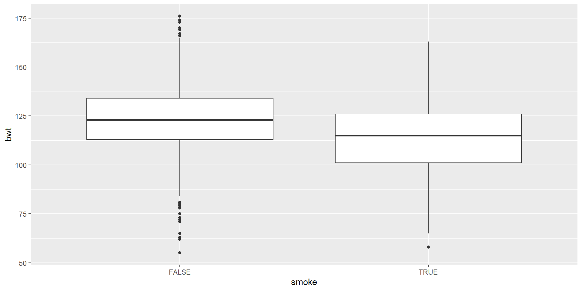
We are visualizing a single numerical and single categorical variable by using geom_boxplot
Anatomy of A Boxplot

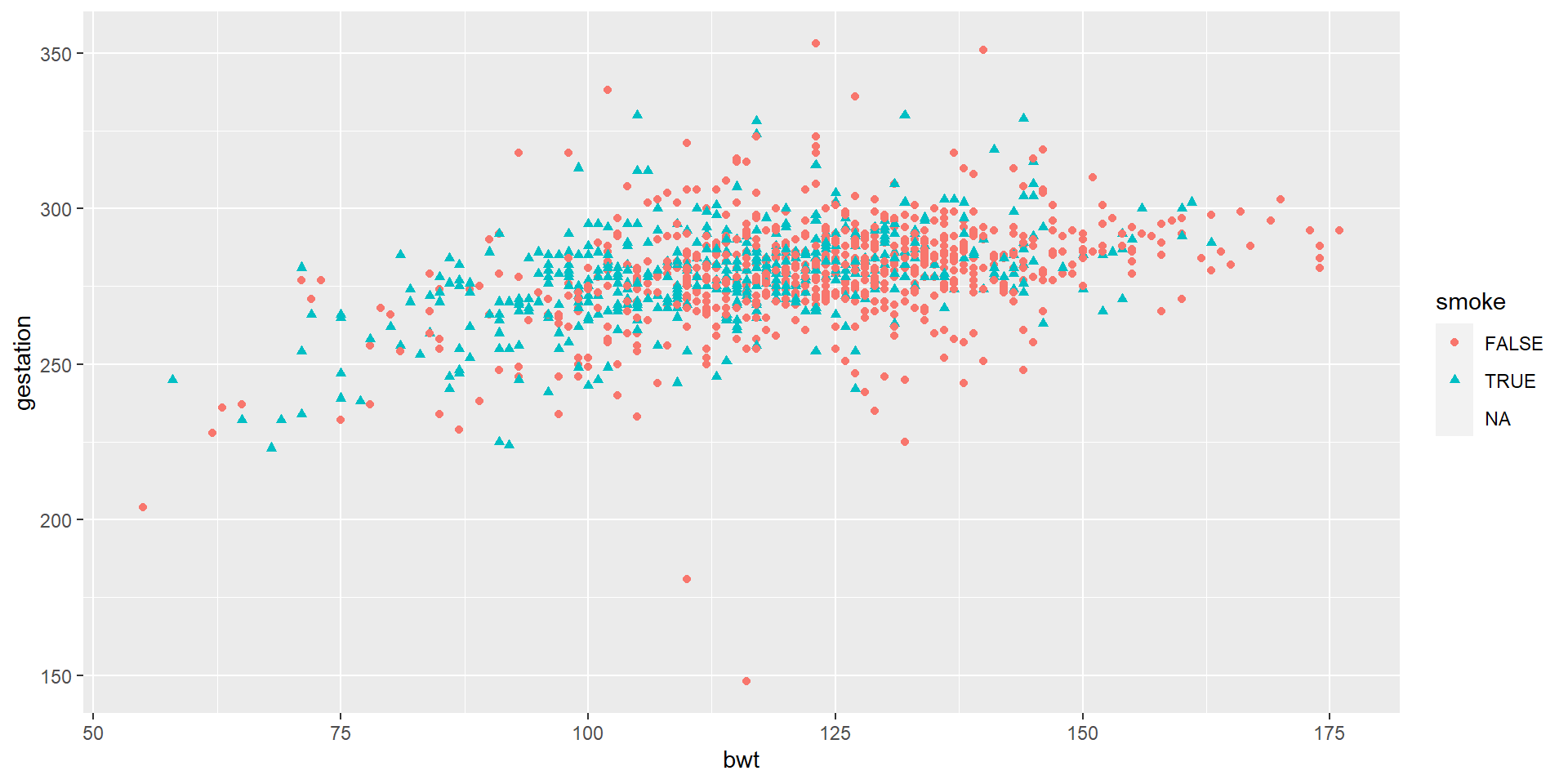
Scatterplot
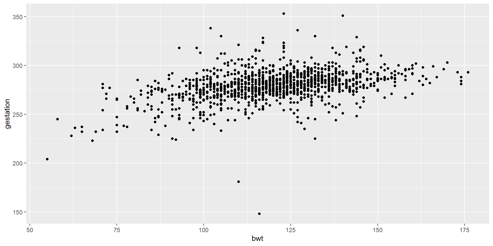
Let’s Try This
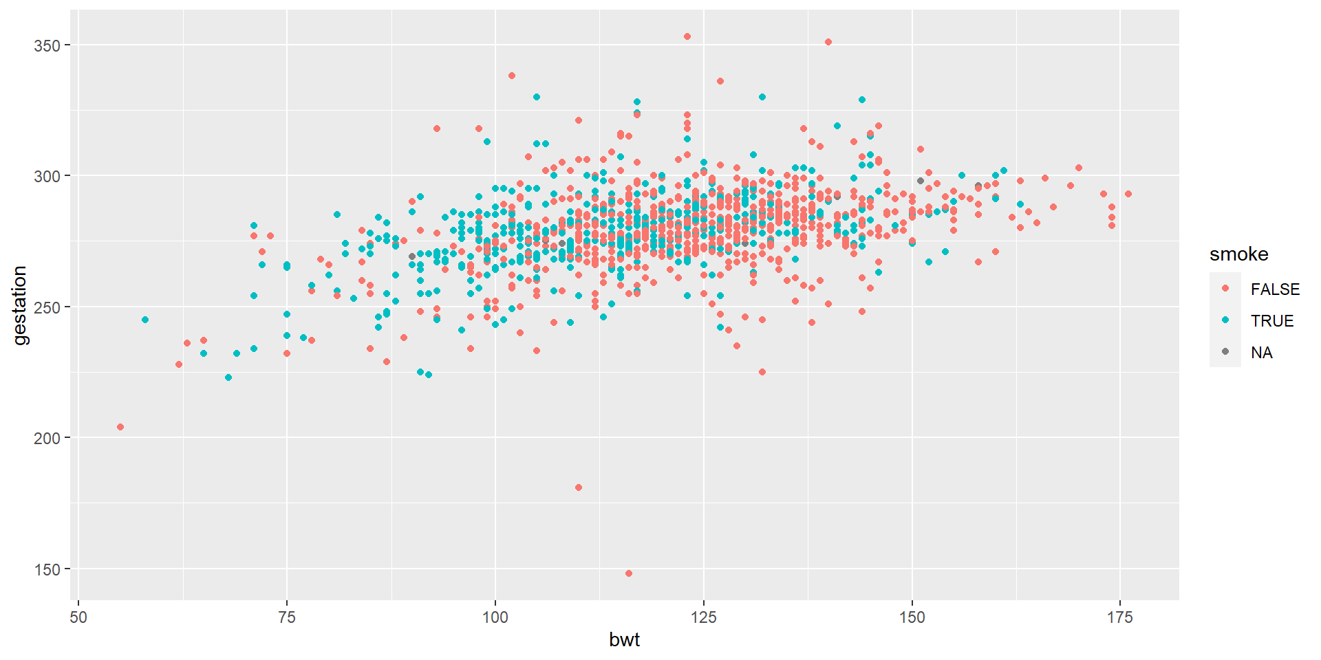
We colored continuous variables by smoke
And Then…
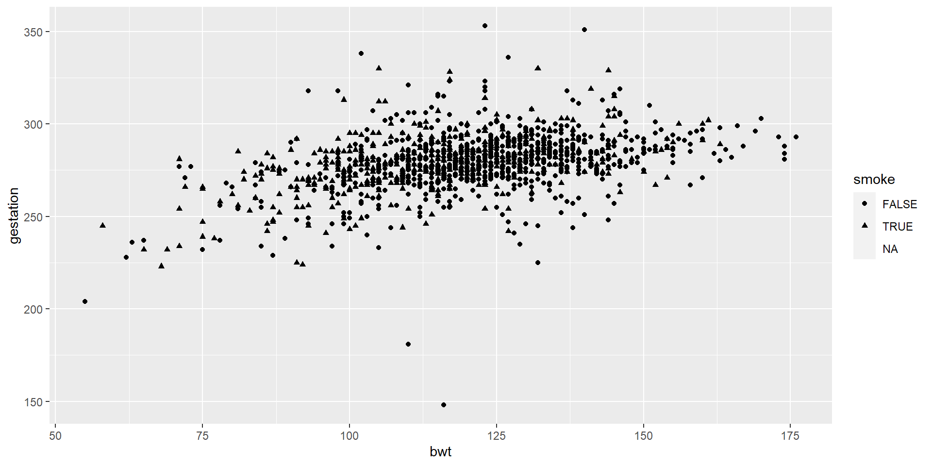
We put different shapes for continuous variables by smoke.
And Then…
Now, we apply both different shapes and different colors.
More on ggplot
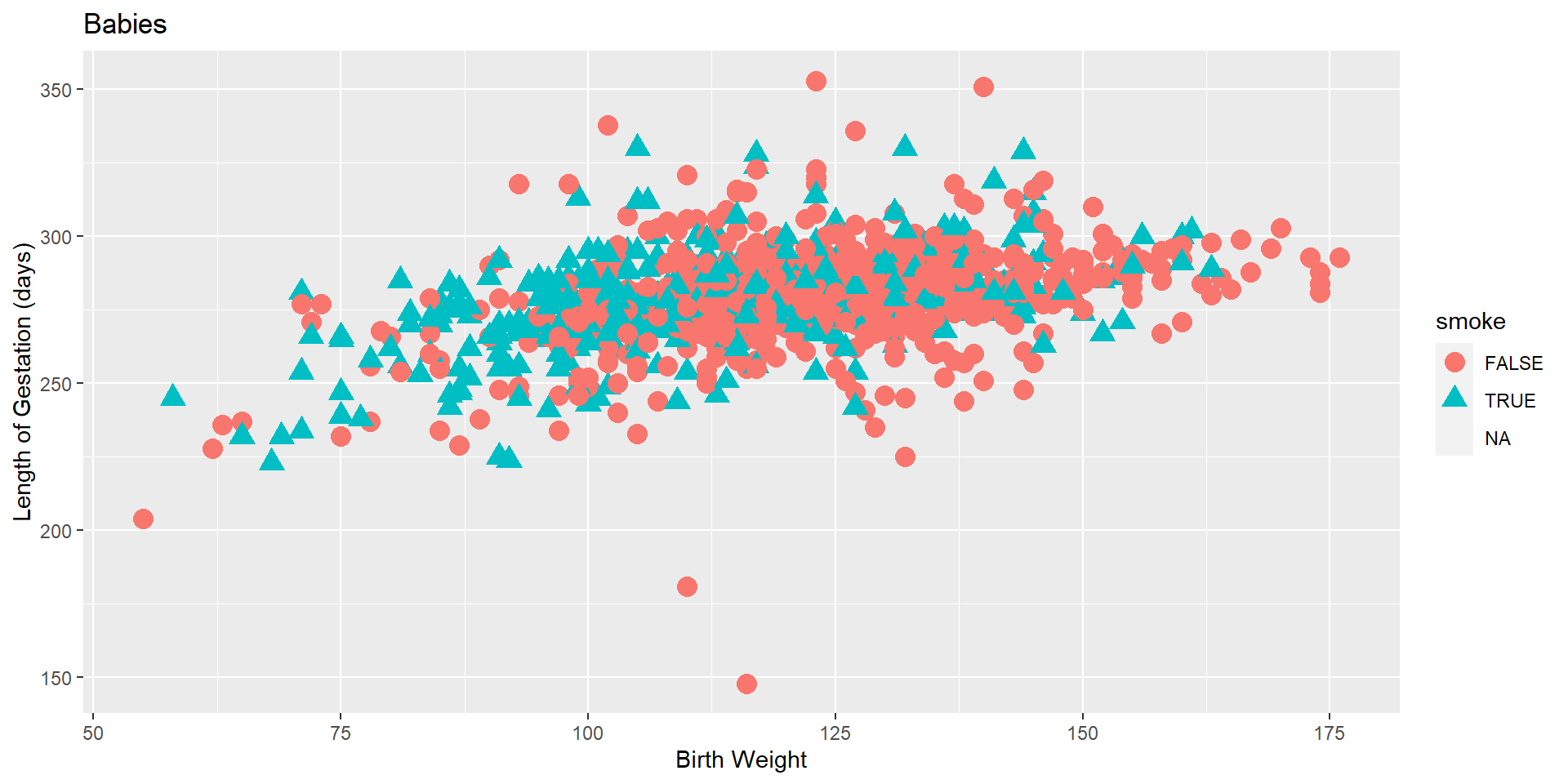
Let’s use labs() function to increase its readability.
And then…
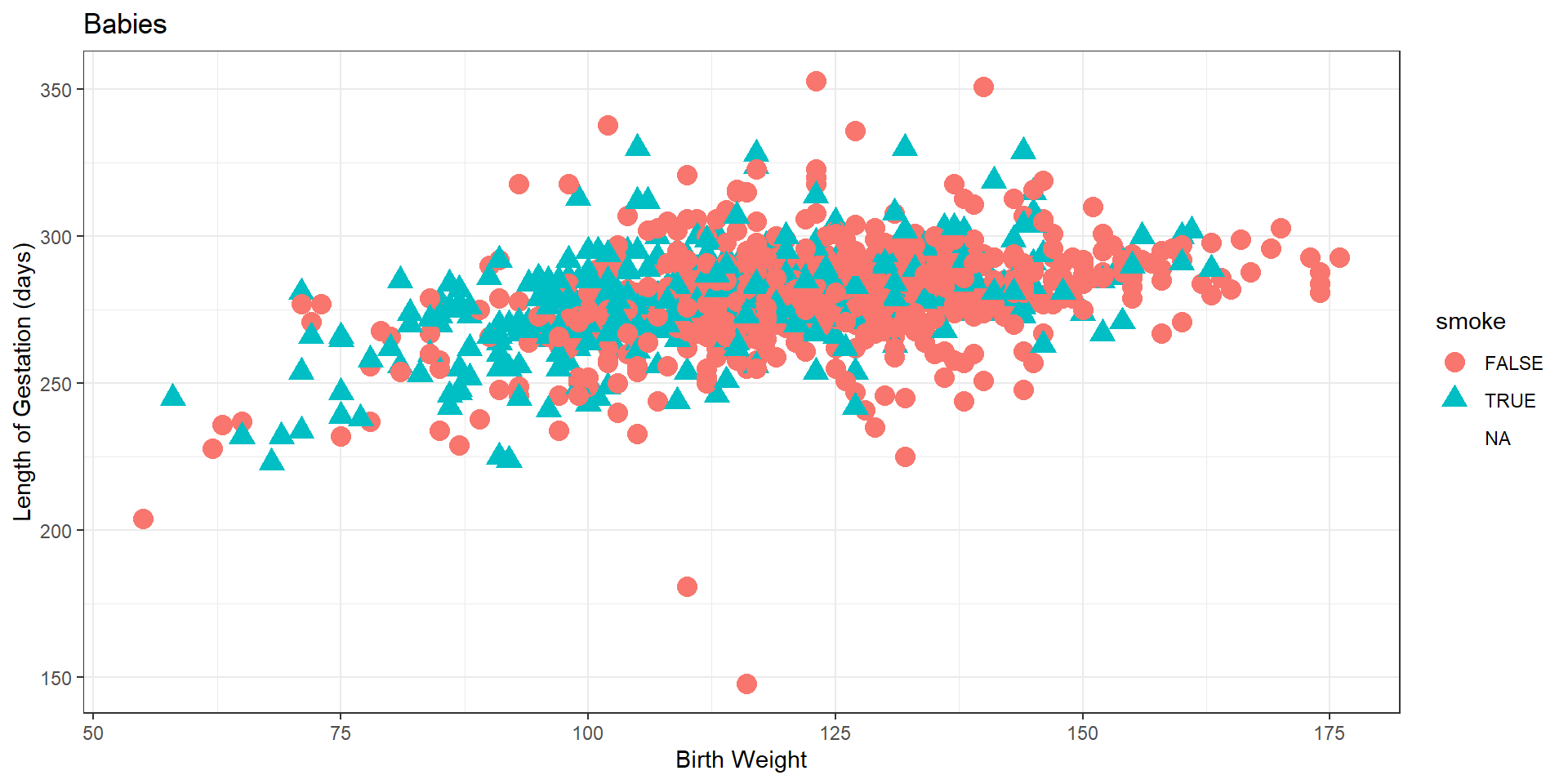
We added another layer called theme_bw(). This function is about the background, the size of the text etc.
And then…
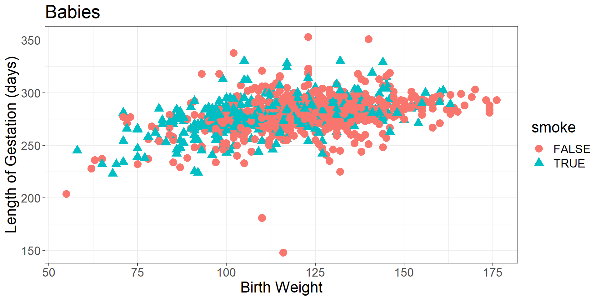
Now, we elaborated this function a little bit more and omit the NA values.